
Introduction
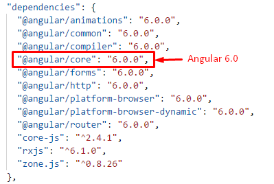
Material Dashboard Using Angular 6.0
- mat-grid-tile
- mat-grid-list
- mat-card
- mat-menu
- mat-icon
ng new materialdashboardangular6
After executing the above command, you can see that the Angular version is now updated to 6.0.0.
Old approach for using Angular Material
Base dependency is angular/material, just type the below npm command into the console.
npm install @angular-material
Next move is to install Angular/cdk, which provides tools for developers to create awesome components. We can install cdk by using npm command.
npm install @angular/cdk
Apart from these two dependencies, we should have Angular/animations installed, because some of the effects in the Angular Material component are dependant on animation. Angular 6.0 comes with Angular/animation so that we do not need to re-install.
New Updates In Angular 6.0
ng add @angular/material
Generating Material Dashboard
Previously we have installed @angular/material, for generating Material Dashboard, we can use a single command to generate a starter dashboard component.
Syntax
ng generate @angular/material:material-dashboard --name =
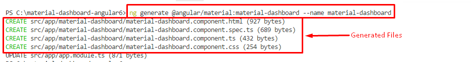
material-dashboard is a starter component, which generates a group of the materialized components in the form of the dashboard by just providing a name, as I’ve provided in the below command.
ng generate @angular/material:material-dashboard --name material-dashboard
And you can see in the console, there are a few files created inside the app directory with provided a component name. The file structure looks like the below screen.
| <div class="grid-container"> | |
| <h1 class="mat-h1">Dashboard</h1> | |
| <mat-grid-list cols="2" rowHeight="350px"> | |
| <mat-grid-tile *ngFor="let card of cards" [colspan]="card.cols" [rowspan]="card.rows"> | |
| <mat-card class="dashboard-card"> | |
| <mat-card-header> | |
| <mat-card-title> | |
| {{card.title}} | |
| <button mat-icon-button class="more-button" [matMenuTriggerFor]="menu" aria-label="Toggle menu"> | |
| <mat-icon>more_vert</mat-icon> | |
| </button> | |
| <mat-menu #menu="matMenu" xPosition="before"> | |
| <button mat-menu-item>Expand</button> | |
| <button mat-menu-item>Remove</button> | |
| </mat-menu> | |
| </mat-card-title> | |
| </mat-card-header> | |
| <mat-card-content class="dashboard-card-content"> | |
| <div>Card Content Here</div> | |
| </mat-card-content> | |
| </mat-card> | |
| </mat-grid-tile> | |
| </mat-grid-list> | |
| </div> |
| <mat-grid-list> // Main grid container | |
| // divides structure in small chunks | |
| <mat-grid-tile *ngFor="let card of cards" [colspan]="card.cols" [rowspan]="card.rows"> | |
| // Every chunks acts as card component | |
| <mat-card class="dashboard-card"> | |
| // Card Header | |
| <mat-card-header> | |
| <mat-card-title> | |
| <mat-menu #menu="matMenu" xPosition="before"> | |
| </mat-menu> | |
| </mat-card-title> | |
| </mat-card-header> | |
| // Content of Card | |
| <mat-card-content class="dashboard-card-content"> | |
| <div>Card Content Here</div> | |
| </mat-card-content> | |
| </mat-card> | |
| </mat-grid-tile> | |
| </mat-grid-list> |
import { Component } from '@angular/core';

@Component({
selector: 'material-dashboard',
templateUrl: './material-dashboard.component.html',
styleUrls: ['./material-dashboard.component.css']
})
export class MaterialDashboardComponent {

// Number of cards to be generated with column and rows to be covered
cards = [
{ title: 'Card 1', cols: 2, rows: 1 },
{ title: 'Card 2', cols: 1, rows: 1 },
{ title: 'Card 3', cols: 1, rows: 2 },
{ title: 'Card 4', cols: 1, rows: 1 }
];
}
TypeScript file contains an array of cards to be generated while creating the dashboard. For that, we can specify how many rows and columns will be occupied to generate card component.
material-dashboard.component.css
Stylesheet file contains different classes to provide different positioning and direction throughout the page.
.grid-container {
margin: 20px;
}

.dashboard-card {
position: absolute;
top: 15px;
left: 15px;
right: 15px;
bottom: 15px;
}

.more-button {
position: absolute;
top: 5px;
right: 10px;
}

.dashboard-card-content {
text-align: center;
}
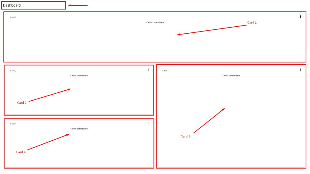
These files are automatically generated for creating Material Dashboard. Now, the last step is to execute our dashboard app.
<!– To Use Dashboard On Application Home page –>
<material-dashboard>
</material-dashboard>
Now, let’s run our Material Dashboard app by running [ng generate -o] command and you can see the output.
Conclusion
- Overview of Material Dashboard and its component
- Package.json file version updates
- New updates in Angular 6.0
- Material Dashboard generating process
- Introduction of all generated files using Material Generator
 Neel Bhatt